Showing posts with label creative projects. Show all posts

Wednesday, September 7, 2011

:: as drawn in and through me ::

i drew this up quickly this morning, in a mad rush of gotta-get-this-down, and i'll grant that it's a bit hard to read and that the photo (iphone) is a bit blurred and dark, but i had to share it. it's my lightbulb-moment flash-of-genius understanding of my business. as drawn in and through me. click to see the image larger.

it's september, which for the eternal student here means it's time for reflecting on where i've been and where i'm going. and usually i sort of keep the reflection to the recent past -- no more than the last year -- but today i'm extra thinky about the further-back past.

this past year has been such a weird one. it was just about exactly this time last year that i found out i was going to be featured in brides magazine, and in the time since then i've done all kinds of stuff with an eye towards building my business.

i don't use a lot of capitals around here, not really sure why other than honest-to-god aesthetics, but that really ought to be capital-b building my capital-b-business, or at least that's how it has felt.

as i've suggested a bunch lately, it has felt a little bit wrong, the building.

and as a result of the wrong-feelingness, the growth of the biz has actually slowed.

which has me thinking about the beginning. the first decision to start up up creative, the first impulses that drove me, the first things i did, the first time i got awesome feedback, the first time i put something out into the word that i really loved and was excited to share.

here are the things i sold on my first day open for business. november 2, 2008.


and i was so so so beyond so excited. and now here i am. still creating other things that just make me want to put them out into the world. to get them into someone else's hands and then to hear their giddy exclamations.

that's the part i live for. it's the center of my business and the center of me.

for a creative biz with a name that isn't the artist's name (i.e. this business is called up up creative, not julie green), i'm discovering that this is a business that works best when i am true to the me-ness of it. when i make decisions driven by my gut. when i create things that make me feel so good and then i pass that good-feeling thing along to someone else to feel good.

i've spent a lot of time trying to come up with a manifesto of sorts. i've been craving a manifesto, actually, which is a big part of what drove the great name-your-price experiment (which is going well, by the way. go check it out). i've been trying to think about what i believe and what my business's core principles are.

and i always get stuck. i easily come up with my own core principles, but i always struggle to come up with my business's core principles.

because right? doesn't it seem like they're not really supposed to be the same? or at least that the business ones shouldn't be so, i don't know, personal?

but i don't know how to come up with principles that don't start from inside my own gut. all i really know is that i started this thing because i needed to make things and i needed those things to make me feel awesome and i needed them to make other people feel awesome. and sometimes i feel like doing one thing and sometimes i feel like doing something else. i am changeable. i like to try new things. i sold a quilt and two necklaces and a calendar on my first day in business forgodssake. i like to challenge the status quo and break the rules. i like to do things my way. if something isn't making me downright-dreadfully-happy (and here dreadfully is a good thing, i believe), i don't want to do it anymore.

which is kind of a weird way to run a business.

but so what. it's how i run mine. and business plans and industry conventions and shoulds be damned, it's how i'm going to keep running it.

so whaddaya think about that? (no, really. tell me. leave comments. email me. sky write a message. i want to hear from you today, please.)

Thursday, September 1, 2011

:: hooray! my name-your-price wedding experiment is here! ::


it's here. september first. that means the name-your-price experiment officially launches today. 

i did a little sneak preview yesterday and the response was so wonderfully wonderful i don't even know what to say. the emails i got. the comments on the introductory post over at a practical wedding.

i woke up a few times in the night just from excitement.

i'm going to be doing some interviews and such throughout the month, getting out there talking about the experiment and the concepts behind it and all. i'll be sure to share those as they happen so you can keep up.

and if you'd like to read some awesome introductions, i'd recommend these:


if you're an artist or designer or maker, i definitely recommend you read through the 60+ comments on the practical wedding post. really cool conversation going on, and seriously awesome points raised. the experiment could FLOP and i would already feel like i got so much out of it just from the comments on that post.

so enjoy. and please! participate in the experiment! whether you need wedding invitations or invitations for something else (birthday parties, holiday parties, baby showers, etc.), now's the time to pay what you can.

Wednesday, June 22, 2011

:: logo re-work ::

after the NSS, you may or may not remember, i was feeling a little existential angst. to quote myself,
i identify so much more with the artists and artisans than i do with anyone else in my industry. every time a buyer admired the color and quality of one of my cards or posters and asked me whether they were letterpress printed or screenprinted and i told them they were printed digitally (in my studio, i sometimes added, though i knew that this sounded small-fry instead of artisanal), the part of me that knew what that sounded like to them just wanted to cringe. and then run out and buy a press or some screens and lend my work the credibility it apparently needs. that i apparently need. i have a very "i made this with my own two hands" ethic to my business but i think i'm always just the smallest bit plagued by the fact that ultimately, everything i make comes from my printer. i really noticed this at the show more than i ever have elsewhere. it's hard to highlight what i feel is a key element to what makes up up creative unique -- the fact that everything (except for the wrapping paper) really is printed in house much like a letterpress shop or a screenprinting shop -- when to most people digital printing is basically at the bottom of the printer's foodchain, even below offset. this is something i think i'm going to have to deal with one way or another during the next year, managing my own perceptions and managing others' perceptions.
my first step in ameliorating the angst has been just a very minor shift in how i describe my business. while "eco-friendly and 100% sap-free" is a very apt tag line for my business, it's not helping me convey the things i'd most like to convey about my business. it doesn't really explain what i do.

"design & print studio," on the other hand, seems to situate me a little bit better among the hordes of screaming stationers out there. it puts it out there that i'm an indie shop (just a little "studio" - doing design & print work); and i like how the word "studio" connotes something a but more artisanal.

to go with the new tagline, i've worked up a few new logo possibilitles. i'm striving for something that represents how i see my design work: clean, crisp, minimalist, and modern but with a certain quiet beauty, maybe a little play between masculine and feminine. i'm also striving to show off some pretty typefaces since fonts are a big part of what i do.

i'm eager for your feedback. what do you think of these 6 logo prototypes? leave me your:

(a) critiques
(b) praise
(c) favorites
(d) suggestions

please and thank you.

Saturday, June 11, 2011

:: birthday invitations for the boy ::


evan's turning four, and this year we told him he could have four invitations to hand-deliver to the four friends he wanted to invite to the party (when he's five, he'll get five). a digital version went out to our families, but evan was so delighted to have actual mail in his hands.

or, rather, in his backpack. that's where he put each invitation (he calls them, quite appropriately, informations as in, "i've got ruby's information in my backpack"). when possible, he delivered them via red bike with that backpack strapped to his narrow little shoulders.

"it even stays on while i'm riding my bike!" he was heard exclaiming, and "when i grow up i am going to do this on the weekends, ride my bike with my backpack on. do you ever do that on the weekends, mommy?"

alas, no. not often anymore.

and of course in terms of printing these for him i went all out. i like to imagine that after we left each invitation with its recipient, it went down something like this:

"wow. i think evan's mommy used 100% cotton paper."

"and what's the font? it looks like futura but not quite? maybe like a small caps version or something? a little bold? very nice. i wish you could make informations like this for me, mommy, like evan's mommy does."

that's what i'd be thinking anyway.

Monday, February 21, 2011

:: coming soon to minted ::

i'm quite cheerfully here today to share some good news. not only was my "vintage treatment" design (shown here) chosen from among 600+ designs to be sold on minted, but it was one of the special editor's picks winners. you are, my friends, looking at the "best personalized calling card design."

i'm most pleased, i think, because i look at this and i look at designs i submitted to minted just a year ago and i see how much i've developed my own design voice in that time. i look at how much i've learned about pattern and texture and about using the tiniest of details to add almost unnoticeable elements that take a design from ho-hum to something more.

it's fun to be able to look back and see the development. and it's fun to win! yay!

:: hurtling planets and other issues (or, how to plan a gorgeous trade show booth on a budget and a conscience) ::

i have a total of three started-and-aborted blog posts about my trade show booth walls. they are, to say the least, stressing me out.

in planning my booth, my design aesthetic and my eco-commitment have collided in a two-planets-hurtling-through-space kind of way and i've found myself spinning and spinning as a result. what's more, my own personal definition of creativity has me bound and determined to find a way to salvage both planets, to coax them into a friendly peace - to swing them into a tight little orbit around my brand.

the point of impact is this:

in my industry, anyway, the booth is the brand. in fact, it's the brand and its the retail shop that will carry that brand. it's job is to invite buyers into a little world that makes them think of their own shops and think, "this is what is missing. this is what i have been searching for."

walls are a big part of this. they're a big part of how we display our products and a big part of creating that feeling that buyers are browsing their favorite corner paper store, not being herded through aisle after aisle, booth after booth.

and i think that hard walls always look better than fabric or paper ones. hard walls complete the illusion in a way that draped walls just don't. and more than that for me, hard walls contribute to the crisp, clean, minimalist up up creative design aesthetic.

but hard walls are a problem, ecologically speaking. because the gold standard for NSS hard walls is foam-core, and foam-core is more or less not reusable and it's certainly not recyclable. we're talking about 208 square feet of foam core board that is not recyclable and not reusable. and that's just for my booth, which is one in what, a thousand-plus? as someone on some blog i was reading earlier said, it's disposable, which really means it's garbage.

garbage that costs anywhere from $400 to (more typically) $1400 and provides you four whole days of beautiful-walled goodness.

fabric and paper are also options for the walls, but they also tend to look messier, less modern, and much more DIY (and not in that good DIY way). in all of my web-crawling travels i've yet to come across a fabric-walled booth that i thought was amazing.

i want to find a booth like that. i need to. because fabric is such a better option: it's reusable from year to year, it has a smaller footprint, it costs less. it's recyclable, in many cases, and even recycled in some.

fabric booths are, to me, ugly. they are not up up-y in the way that i need them to be for this trade show. but the part of me that believes that the best design comes from constraint also sees this as the ultimate design challenge. it is a problem to be solved, not avoided.

it's hard, though. because these aren't the only constraints. there are rules about what materials can be used at the trade show. rules about what we can carry in and what tools we can use to assemble our booths. and there are budgetary constraints. just reserving the space for this event costs in the thousands and while i could certainly create an ubercool ubereco booth on an unlimited budget, the budget's not just limited but pretty severely so.

and yet a decision has to be made. we're nearing march and it's time to order what needs to be ordered, construct what needs to be constructed. it's time to wrangle these planets into orbit before either one of them begins to implode.

what do you think? should i build birch walls? experiment with stiffened fabric? focus on free-standing shelves? should i order the foam core but find a way to recycle or reuse it after the event? help!

Wednesday, February 2, 2011

:: up up creative for snapfish ::


the kiddos are at daycare today (yes! new situation! we're doing part-time daycare! and it's working out well!) and i've got lots on my plate, from wedding proofs for clients to emails that need to be answered to prepping a bit more for the national stationery show. but first among the projects is going to be working on some new designs for snapfish.

things there are going well. i've got some bestsellers and everything.

so i'm wondering: what would you like to see from up up creative for snapfish? any special requests? your wishes are my commands, my friends. you (yes you) can shape what goes up on snapfish.com. now that's power.

(curious what i've got there already? the image above shows the 16 designs currently for sale in both the UK and US shops. follow the links to get there yourself.)

Monday, November 29, 2010

:: a calendar of my very own ::

flummoxed designer seeks someone to tell her
how to hang her awesome new poster-sized calendar. please help!
recently while sprucing up my studio walls with some yummy goodness (some embroidered art i did when i started up up creative, artwork by illustrators i admire, etc.) i realized i needed a big-ol-calendar on the wall next to my desk and decided it was time to take a few hours away from work-for-others and do a little bit of work-just-for-me.

i present: the result. i love it, printed all large (13x19) on this delicious 100% cotton paper i have and all. but i can't for the life of me figure out how i want to hang it. a simple hole at the top, hung over a nail? a bulldog clip holding the paper? two holes and some string? i just. can't. decide.

thoughts?

Wednesday, October 27, 2010

:: elopement announcements ::

 
my favorite-project-of-the-moment? elopement announcements for laura and brandon (based on this modern invitation design in the up up creative shop. this adorable couple took off to new mexico for the most totally-freaking-gorgeous private ceremony and upon their return hired me to create a fun, sweet announcement for their friends and family.


i chose the colors to match their storybook wedding pics and i cannot even begin to explain how happy the finished product makes me. and this couple, frankly.

what a good idea, elopement announcements. have you heard of anything like that before?

Friday, October 1, 2010

:: and great things will happen ::

i originally sketched this in my notebook and planned to embellish it before turning it into a desktop wallpaper, but the more i played around, the more i fell in love with just the original sketch, rendered a bit sketchily and in graphite gray.

download it and imagine that i drew it right on your desktop.

cool, right?

Friday, September 17, 2010

:: preview of coming attractions ::

product preview

i'd say i'm about 75% of the way to a big release of 34 brand new greeting card designs based on my top-selling crazy love cards. in fact, i'm ready to release them except that my photos from today didn't turn out well and i need to make another attempt.

{shaking fists} damn you, product photography!

here's a preview for you loyal blog readers. 25 of the 34 designs. click on the image to see it larger for full effect.

do you have a fave?

Friday, September 10, 2010

:: the 2011 fear project ::

The Sketchbook Project: 2011

ever since that whole postpartum depression thing when evan was born, i've had a fascination with fear. at the time, i found myself plagued by all kinds of strange fears: a fear of showering, a fear of lying on my right side, a fear of tomatoes.

now that most of my illogical or otherwise bizarre fears are gone, they seem sort of funny; but at the time, they were as real as being afraid of a nearby bear or bee.

this fall i'm conquering a new fear - one that's a far more common fear as fears go, but one that's far less logical than my seemingly nonsensical postpartum fears. i'm conquering a fear i have of participating in the 2011 sketchbook project.

i cannot figure out why i'm scared to do this other than the fact that i'm scared my sketchbook will, um, well, suck. ah, that oh-so-common fear of failure.

but suck it will just have to do if that's the way this project's going to go because i've paid my money and i've received my sketchbook and i'm 100% committed to seeing this silly little fear destroyed, demolished, and otherwise de-feared.

if i really get my nerve going, maybe i'll share some of the sketchbook pages with you. wouldja like that?

Wednesday, September 1, 2010

:: on the verge ::


as promised, a new illustrated desktop wallpaper for september, and it's a beaut if i do say so myself. i've had it on my own desktop since last week when i finished it - just needed to have it right there in front of me all the time. download it here.

look for the next wallpaper design on october first. in the meantime, keep reading!

Tuesday, July 27, 2010

:: creativity and constraint ::


i'm currently working on developing a recurring column for scoutie girl about eco-friendly art and design (more on that soon). as part of that, and perhaps even more so in my own work right now, i'm thinking a lot about creativity and constraint.

case in point: last year's illustrated desk calendars.

they are probably still one of my favorite up up creative products ever. something about them just made me so happy - the colors, the paper, the wide-format case, the hand-illustrated patterns.

but i can't help but feel like right now, they're kind of pathetic in terms of their eco superpowers. so for 2011, i am placing some new constraints on myself. i want to create desk calendars that are as lovely, but that are eco-friendlier. last year's used recycled paper, as do all of my things. but for 2011 i'm trying to experiment with various display options, paper sizes, arrangements, etc. i'm limiting my resources with the hope that in the end, i'm going to come up with something not just artistic but truly creative.

as i lay on my attic floor this afternoon brainstorming calendar possibilities and playing and all, i doodled myself a little reminder. and then i decided to turn it into desktop wallpaper. and then i decided to share it with you. i hope you enjoy it.

download it here. save the jpg file and set it as your desktop background. voila!

(p.s. i've decided to make these wallpapers a monthly thing. we're going to count this as august 2010's since i'm going to be "away" this weekend celebrating my fifth wedding anniversary (we're not actually going away, but we're getting kid-free time and celebrating nonetheless). come back at the beginning of september for the next installment.)

Monday, March 8, 2010

:: the decision ::

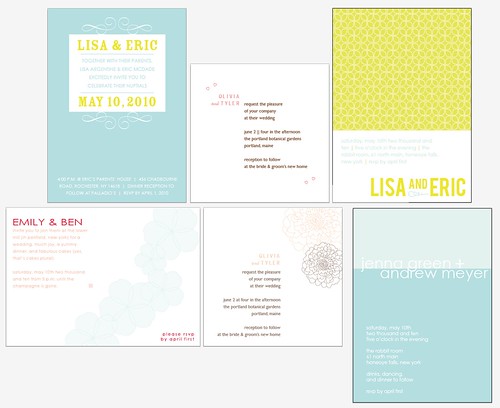
thank you all so much for your help this weekend. i ended up submitting the following three designs, all of which evolved a bit over the course of the weekend thanks to feedback from some talented designers, friends, and family members:


there was a lot of enthusiasm for the top left design (see this post), as well, but something about that one just isn't finished to me and i can't put my finger on what it needs. rest assured that one or something like it will appear soon.

Saturday, March 6, 2010

:: indecisive ::


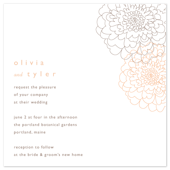
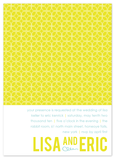
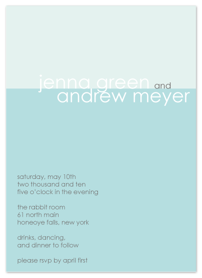
i'm not usually a last-minute girl. in fact, i am never a last-minute girl. but here i am at the last minute trying to choose just three of these six wedding designs to submit in order to vie for the opportunity to release my very own wedding stationery line at minted.

the designs are ready and all. the only thing last minute-y about this is that i just can't decide which three i like best.

can you help a girl out? preferably today??

you can click on the image above (or click here) to see it much larger if that would help. yeah. i think that would help.

Monday, February 22, 2010

:: cleanifying ::

tara gentile (also of scoutiegirl fame) featured my up up redesign on her personal blog today among several other minimalist blog designs. i was pleased as punch. i was telling her that i wish i could revamp my home as easily as i revamped the blog: change a few hexadecimals here, hit delete a few times over here, slide this gadget over above this other one.

i love a home that looks lived in and i believe in having the things we use everyday close at hand, but man would i love to just click a few keys and be able to downsize and declutter and cleanify everything around me. much as i hate to clean and organize and all, i crave a peaceful and orderly environment. not stark, just a little bit sparser.

the only place in this house i've really been able to achieve that is in emily's room. i've been meaning to post (okay, also meaning to take) these photos for a long time. well, today's finally the day.
behold: the nursery.

{ we kept the walls as they were when we moved in: a sort of very pale soy latte sort of color. i also chose to reuse some of the blue things we had from evan's nursery. blue happens to be my favorite color even though i'm a
girl and i just like that it keeps emily's mostly-pink room from seeming overly pink. }

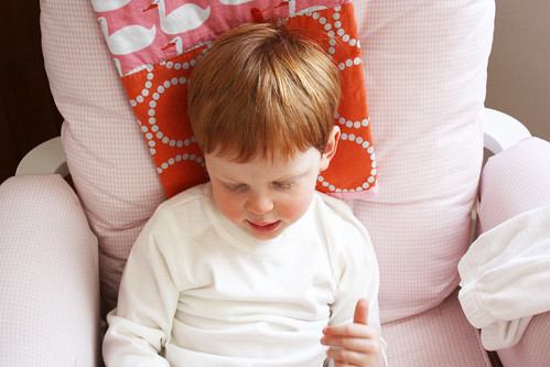
{ most everything about the room was inspired by the quilt here behind evan's head which was intended as a wall hanging but which has taken up residence here on the chair instead, which is just fine by me. i just fell in love with the fabric (red letter day by lizzie house) and how it was childish and fun and pink and orange and brown without being all girly. the leftover fabric also features prominently in the embroidery-hoop wall art throughout the room. i also used coordinating solids for the mobile. }

{ can't resist including this great shot of evan. he "helped" me take all these pictures. }

{ i removed the animals and reused the parts from evan's mobile (a jungle-themed mobile from babies r us) to make this one for emily (you can find a link to the fabric pom pom tutorial here). she loves it so much. smiles whenever we place her beneath it on the changing table. because i was able to reuse and repurpose some stuff, the only new things i had to buy for emily's room were sheets for the crib (plus the fabric and the embroidery hoops already mentioned). }

{ more fabric art. such an easy and pretty way to decorate nursery walls. }

{ hand-embroidered by yours truly. a lowercase e for my little emily. (i've taken to referring to evan as uppercase and em as lowercase. i know, i know.) my spiffy new camera shows off the remains of the chalk lines i drew before embroidering. thankfully you really can't see them in real life. }

because we decided not to reuse evan's safari-themed nursery decor and because the room was empty when we started, and perhaps especially because i didn't want to spend more than about $100 on new things for the room, i had a completely blank canvas and the opportunity to put in just enough and no more. her nursery is pretty tiny, and she doesn't have toys strewn about yet, so hers is the room in the house now that is the most peaceful, most orderly, and most pulled together.

i'd love it if i could do the same for my own bedroom. just wipe it clean and start fresh. the first thing i'd banish would be laundry, both clean and dirty.

it's a pipe dream, i know. it would result in laundry strewn about
other parts of the house, which would be no better. but still. a girl can dream, right?

***

p.s. who knows why there aren't any books in emily's gramps-made book rack. god knows there are books
everywhere else in the house. there's a stack of kids' books nine inches high by my feet as i type!

Tuesday, February 9, 2010

:: letterpress play ::


about a month after emily was born, after my first week home by myself with the two kids, brian gave me a gift:


no, not a letterpress, although wouldn't that be cool? he gave me a letterpress class. his good friend from high school co-owns dock2letterpress here in rochester.

the class taught me a few things:


(a) letterpress prints are as cool as i always thought they were
(b) letterpress printing, on the other hand, is far less mysterious and esoteric than i imagined, even on century-old presses.
(c) it's a lot lot harder setting wood and lead type than it is to play with, manipulate, and arrange type digitally. i'm so used to being able to adjust leading, kerning, justification, type size, etc. with the click of my mouse. figuring out how to align and arrange my type, and how to keep it from falling apart when i lifted it up to take it to the press, was far more difficult.


as a result i am not all that in love with my first-ever hand-typeset design, but i'm thrilled with the prints themselves.

the best thing is that now, since i've taken the class, i can rent time on the presses in the future for my own projects. you can bet you'll be seeing some letterpress items coming to my shop in the next year or so. if i'm not paralyzed by trying to decide what to make first, that is.

Saturday, February 6, 2010

:: behind the redesign, coming soon ::

thanks to a slow day in the shop yesterday, i gave myself permission to do something a little non-emergent today. it wasn't intended to be a full blog redesign, but here it is anyway. much simpler and more streamlined.

i'm planning on writing up a little post about my process with the redesign. look for it this week.

if you don't see the new look, hit refresh in your browser and it should magically appear.

Sunday, January 31, 2010

:: free color-your-own valentines ::


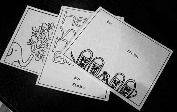
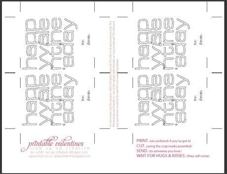
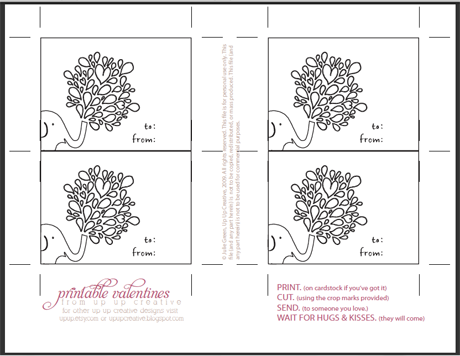
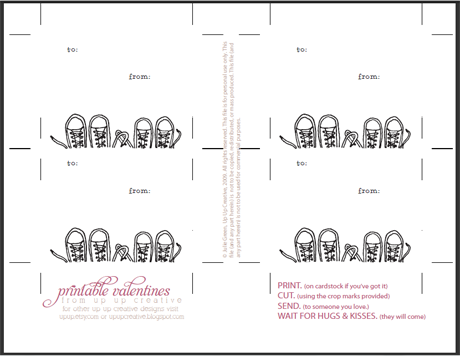
probably you caught my hint, what with me saying "hint, hint" and all at the end of the post. so i'll spare you the rigmarole and just post the link: download all three of these supercute color-your-own valentines right here.