i am...
... an indie business owner slash entrepreneur slash graphic designer trying to find my way (emphasis on MY, not way) to earn a living and do it beautifully. you can find my wares at upupcreative.com or on etsy. i'm also a designer for snapfish and minted.
... a former college teacher and ph.d. student (in english) with a thing for words and a need to speak the truth
... mom to evan (who turned four in june '11 and who cracks me up, frustrates me, and amazes me on a daily basis) and emily (who is the sweetest baby ever ever ever - she will be 2 in december '11)
... married to a lawyer. enough said? nah... i'm just kidding. married to brian (who is awesome and just happens also to be a lawyer) for six years as of june 2011.
... slowly recovering posts from the old blog (see archives) (which, sadly, disappeared into thin air...)
... a post-partum depression & anxiety survivor. if you found me because of that, definitely read through the archives, reach out and say hi, and more than anything else just hang in there.
up up creative - news from the shop
.
keep in touch
copyright
© 2006-2011 julie green / up up creative unless otherwise noted. all rights reserved. please do not use my original artwork, photographs, or other content without my explicit permission or without providing credit/attribution.
blog archives
 |
| My holiday photo cards now available at Minted.com |


9 comments:
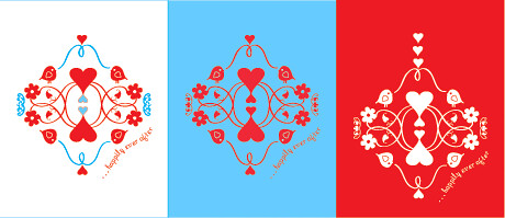
I love the red and blue on the white background! Really lovely design!
Oh, beautiful! The white background looks the most "wedding" to me.
yeah, actually, i see your point about the white one being the most wedding-ish.
i think the white and the red backgrounds look equally "wedding" but I think having the bits of blue on the white background really help the details of the image stand out..
..very very cute, btw
I cant decide between the red and the white backgrounds but i think im leaning towards the red because its unexpected. im sure they will receive lots of white cards so the red would stand out as somehting special.
ps. i would love to see the red card tweeked to make it a valentines card ;)
I just love them all!!!!! Would look awesome on material, cushions, curtains etc etc. VERY beautiful! What a talent.
you guys sure know how to make a girl feel good. thanks! : )
super adorable!!! The white background and the red background pop out and are eye catching.
Either way they will receive a gorgeously unique card :)
White background for sure!! :)
Post a Comment