:: Three Things (Or Maybe Four) ::
OK. First, I have to get this out of the way: someone found this blog by Googling "dumbest dissertations ever." Is that necessary, Google? Did you really need to send that person here? That just hurts a girl's feelings.
Seriously.
Second: I am hereby publicly declaring that by the time I pick Evan up from daycare tomorrow, Friday May 9th, I will have completed-if-very-very-rough drafts of both my current dissertation chapter and my encyclopedia article.
What? I didn't tell you I'm writing an encyclopedia article? Yeah, that's because I've been alternately laughing like a drunk hyena at the fact that they asked me to write it and pretending it's not due by June 2nd. Really, though: what business do I have writing an encyclopedia article? I still feel like I need to read encyclopedia articles.
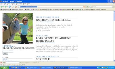
Third, there's this: I had to make my public declaration in point two above because otherwise I might just keep staring at this.
You may or may not remember when I started thinking about designs... Well, I've been slowly playing with different ideas over at my new URL (dontcha just love that all the good domain names are used up so they keep releasing new extensions: .us, .com.us, .mobi... it cracks me up). I meant to work on the chapter and article last night, but Brian was out of town (again!) and I decided to play a little over dinner and, well, four hours later I emerged from the basement office to make formula and go directly to bed. No passing go, No $200.
I'd love it if you'd take a look and give me your honest feedback (on THIS post, if possible). Whaddaya like? Whaddaya not like? What works? What doesn't? It's set up with old posts from the current blog.
I myself just love the front page (shown above). The picture's one Brian took this weekend while we were playing with Evan at the park and it totally inspired the whole design. But I also love it that I'll be able to change that image periodically without changing the whole thing.
Oh yeah. One more thing: WHAT IS WITH THE STUPID QUILT-LOOKING AVATARS NEXT TO OUR COMMENTS? Wordpress seems to have changed those WITHOUT MY KNOWLEDGE OR CONSENT and I really REALLY hate them and I am NOT HAPPY. Grr...


5 comments:
{heart} the new design! It's very... active! lol and lively. Kinda like a certain 11-month-old. (10?)
I like the categories at the top of the post, tho I'm not sure why. Very easy to navigate, too.
OK, really, I'm just commenting so I'll see my quilt square....
I like the new design. Pretty white space on the right, nice organization on the left. Love the picture! I can't decide if I like the categories above the post title, though. Will you keep the truncated posts style, or will you open it up to full posts on the main page?
I need to someday get back to working on my personal domain. I uploaded Wordpress and haven't done anything with it since then. Still can't find a template I like.
I like it. Because you have cute category names it really works to put them above the posts. It's easy to get around. I too am curious about the truncated posts though. It seems petty to get one's feathers ruffled over a single click through but when your computer is as slow as mine is it can make the difference between reading and not. Of course, I would click through for your posts regardless... I'm just thinkin' about OTHER people.
The new design is gorgeous! I didn't have time to really poke around, but I was very impressed with my quick glimpse.
I like it. Very clean and fresh. Makes me happy. :)
Post a Comment